Position in CSS
Let's explore position in CSS.
The position property determines where an element appears in a document. Elements are then positioned using the
top:bottom:left:andright:attributes. These attributes, however, will not function until the position property is initially set.There are five possible position values:
staticrelativefixedabsolutesticky
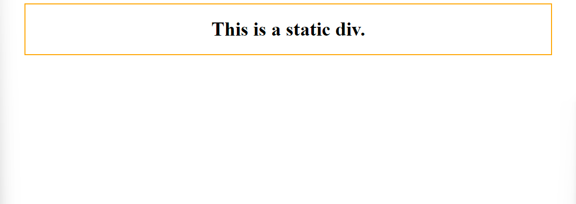
static- By default, HTML components are static.
- Static positioned elements are unaffected by the
top:bottom:left:andright:properties.
HTML
<!DOCTYPE html>
<html lang="en">
<head>
    <meta charset="UTF-8">
    <meta http-equiv="X-UA-Compatible" content="IE=edge">
    <meta name="viewport" content="width=device-width, initial-scale=1.0">
    <link rel="stylesheet" href="./style.css">
    <title>Document</title>
</head>
<body>
    <div class="static">
        <h1>This is a static div.</h1>
    </div>
</body>
</html>
CSS
.static {
    position: static;
    border: 2px solid orange;
    text-align: center;
    margin: 0 40px;
}
Output
2.relative
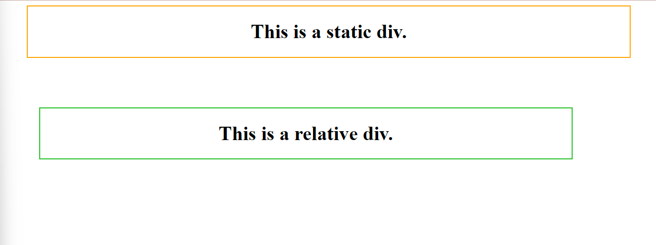
- The location of an element with
position: relative;is relative to its usual position. - Setting the
top:bottom:left:andright:properties of a relatively-positioned element moves it away from its typical location. Other content will not be resized to fill any gaps left by the element.
HTML
<!DOCTYPE html>
<html lang="en">
<head>
    <meta charset="UTF-8">
    <meta http-equiv="X-UA-Compatible" content="IE=edge">
    <meta name="viewport" content="width=device-width, initial-scale=1.0">
    <link rel="stylesheet" href="./style.css">
    <title>Document</title>
</head>
<body>
    <div class="static">
        <h1>This is a static div.</h1>
    </div>
    <div class="relative">
        <h1>This is a relative div.</h1>
    </div>
</body>
</html>
CSS
.static {
    position: static;
    border: 2px solid orange;
    text-align: center;
    margin: 0 40px;
}

.relative {
    position: relative;
    border: 2px solid rgb(36, 192, 36);
    text-align: center;
    width: 80vw;
    left: 60px;
    top: 80px;
}
Output
3.fixed
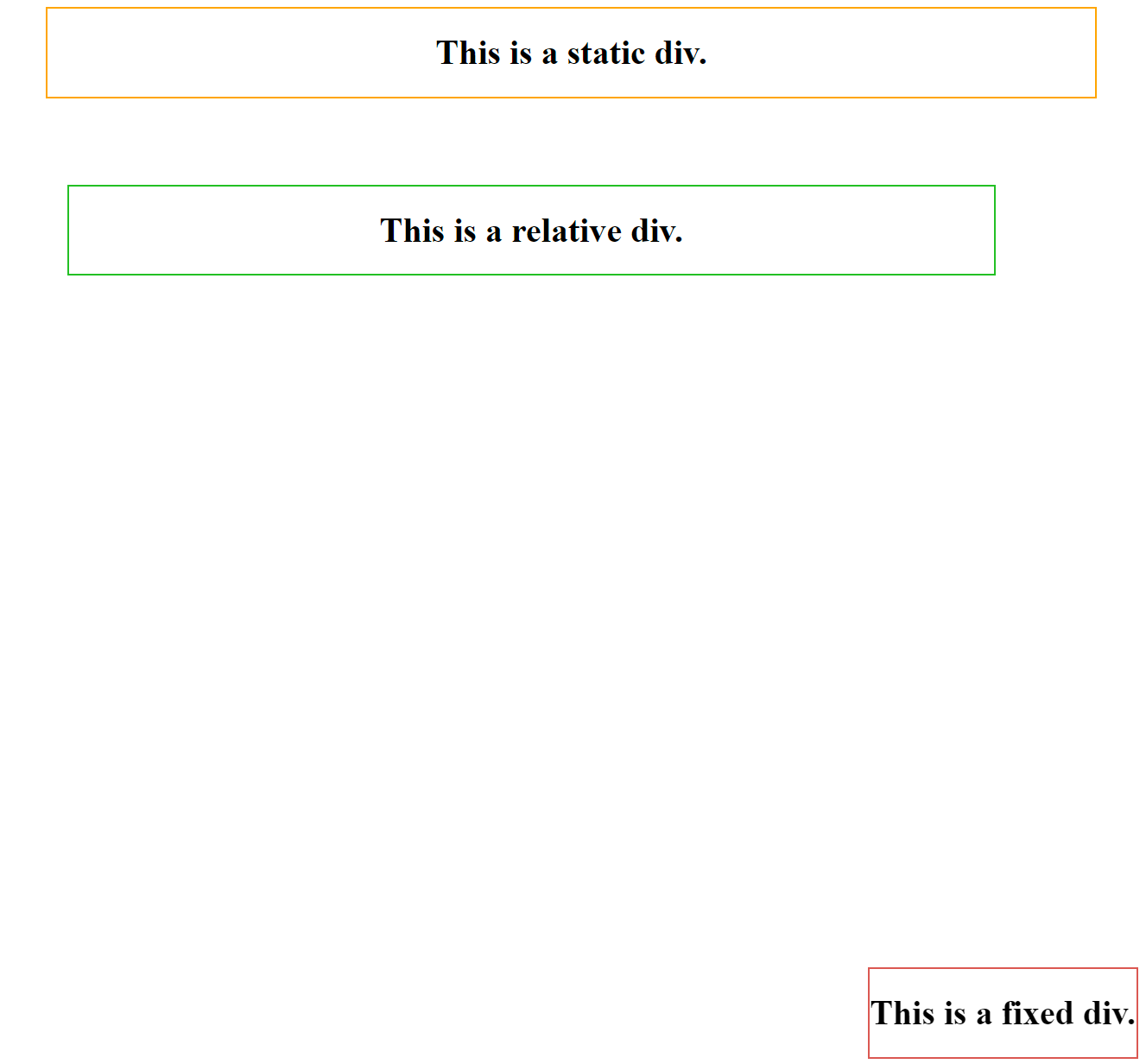
- The element is removed from the usual document flow, and no room is made in the page layout for it.
- It is position relative to the viewport. The values of
top:bottom:left:andright:define its final position.
HTML
<!DOCTYPE html>
<html lang="en">
<head>
    <meta charset="UTF-8">
    <meta http-equiv="X-UA-Compatible" content="IE=edge">
    <meta name="viewport" content="width=device-width, initial-scale=1.0">
    <link rel="stylesheet" href="./style.css">
    <title>Document</title>
</head>
<body>
    <div class="static">
        <h1>This is a static div.</h1>
    </div>
    <div class="relative">
        <h1>This is a relative div.</h1>
    </div>
    <div class="fixed">
        <h1>This is a fixed div.</h1>
    </div>
</body>
</html>
CSS
.static {
    position: static;
    border: 2px solid orange;
    text-align: center;
    margin: 0 40px;
}

.relative {
    position: relative;
    border: 2px solid rgb(36, 192, 36);
    text-align: center;
    width: 80vw;
    left: 60px;
    top: 80px;
}

.fixed {
    position: fixed;
    border: 2px solid rgb(218, 88, 82);
    text-align: center;
    bottom: 10px;
    right: 10px;
}
Output
4.absolute
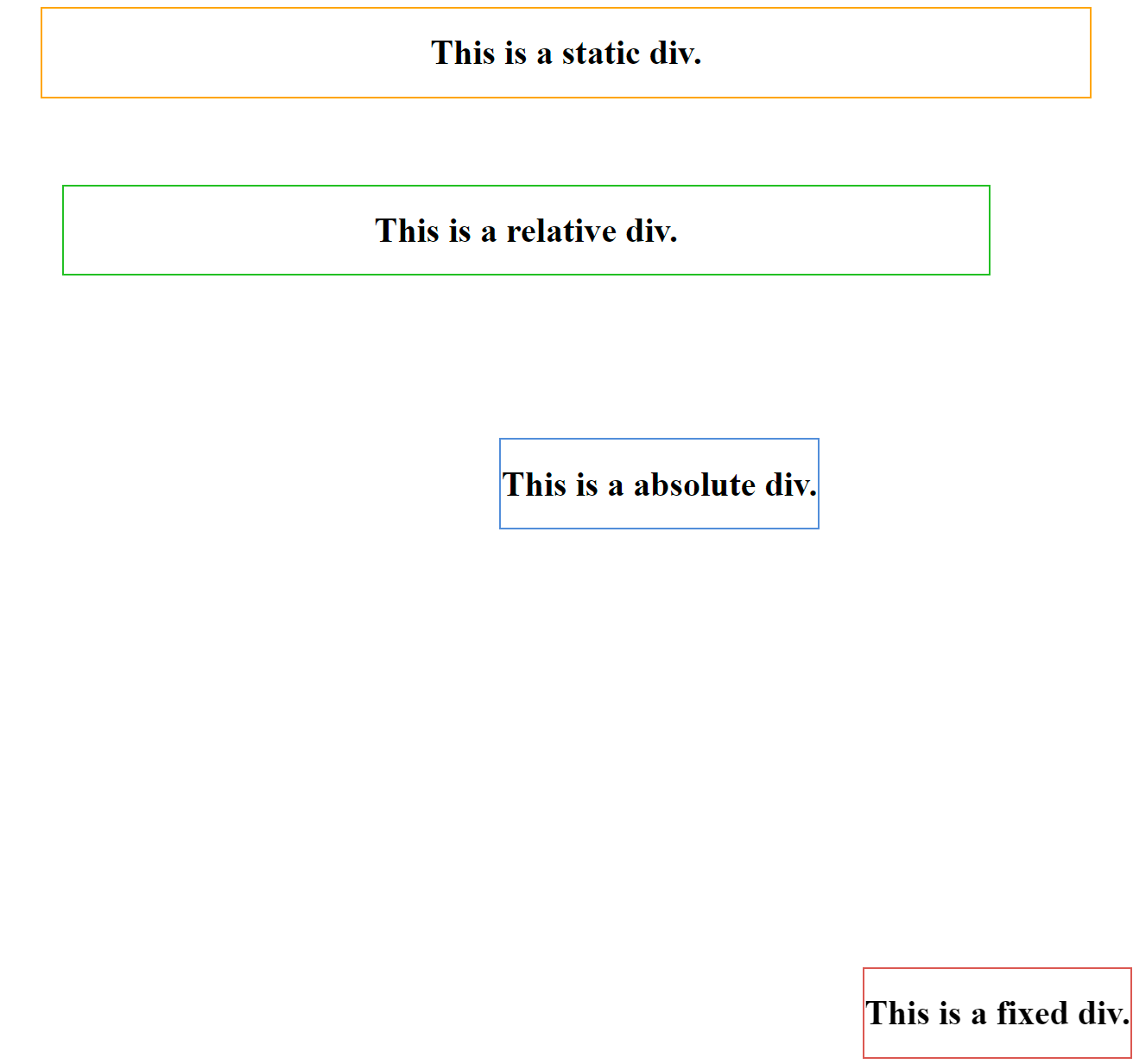
- The element is removed from the usual content flow, and no room is made in the page layout for it.
- It is positioned in relation to its nearest ancestor.
- If an absolute positioned element does not have any positioned ancestors, it falls back on the document body.
HTML
<!DOCTYPE html>
<html lang="en">
<head>
    <meta charset="UTF-8">
    <meta http-equiv="X-UA-Compatible" content="IE=edge">
    <meta name="viewport" content="width=device-width, initial-scale=1.0">
    <link rel="stylesheet" href="./style.css">
    <title>Document</title>
</head>
<body>
    <div class="static">
        <h1>This is a static div.</h1>
    </div>
    <div class="relative">
        <h1>This is a relative div.</h1>
    </div>
    <div class="fixed">
        <h1>This is a fixed div.</h1>
    </div>
    <div class="absolute">
        <h1>This is a absolute div.</h1>
    </div>
</body>
</html>
CSS
.static {
    position: static;
    border: 2px solid orange;
    text-align: center;
    margin: 0 40px;
}

.relative {
    position: relative;
    border: 2px solid rgb(36, 192, 36);
    text-align: center;
    width: 80vw;
    left: 60px;
    top: 80px;
}

.fixed {
    position: fixed;
    border: 2px solid rgb(218, 88, 82);
    text-align: center;
    bottom: 10px;
    right: 10px;
}

.absolute {
    position: absolute;
    border: 2px solid rgb(82, 141, 218);
    text-align: center;
    bottom: 500px;
    right: 300px;
}
Output
5.sticky
- It is positioned based on the user's scroll position.
- Depending on the scroll position, a sticky element switches between relative and fixed mode. It is positioned relative until a certain offset position in the viewport is met, at which point it "sticks" in place.
HTML
<!DOCTYPE html>
<html lang="en">
<head>
    <meta charset="UTF-8">
    <meta http-equiv="X-UA-Compatible" content="IE=edge">
    <meta name="viewport" content="width=device-width, initial-scale=1.0">
    <link rel="stylesheet" href="./style.css">
    <title>Document</title>
</head>
<body>
    <div class="stickyParent">
        <h1 class="sticky">This is a absolute heading.</h1>
        <p>Lorem ipsum dolor sit, amet consectetur adipisicing elit. Quis ratione, nam dolorem magnam quos commodi. Sed laboriosam voluptatem reprehenderit corrupti labore qui dolore excepturi impedit quos modi dolorem quibusdam voluptas nam delectus, corporis quas hic temporibus assumenda quis est dolor earum ratione! Similique aperiam suscipit, odio recusandae incidunt officiis impedit omnis inventore? At dicta delectus error quos accusantium mollitia commodi porro quae. Culpa veritatis consectetur iste consequuntur illum. Nihil, ullam sint quod, vero ab perspiciatis necessitatibus pariatur ad architecto beatae explicabo quidem, dolorem tempore perferendis facilis similique autem. Tempore quas voluptatibus nulla at natus necessitatibus odio odit. Dolorum, tenetur maiores. Lorem ipsum dolor, sit amet consectetur adipisicing elit. Explicabo vel cum accusamus a quisquam sed possimus eum atque, impedit dolorum eius, consequatur quos libero corrupti ullam exercitationem, totam voluptatem dolor ab temporibus nostrum. Officia ratione vero provident! Vitae fugiat, porro aliquam quam, facilis incidunt maxime commodi similique illo corporis obcaecati!</p>
    </div>
</body>
</html>
CSS
.stickyParent {
    height: 120px;
    overflow: scroll;
    display: flex;
    background-color: rgb(135, 212, 135);
}

p {
    width: 60vw;
}

.sticky {
    color: red;
    position: sticky;
    top: 0;
    border: 2px solid blue;
}
Output
Before scroll

After scroll



